
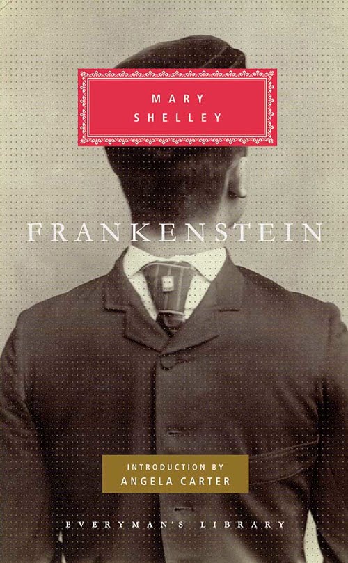
An unusual, refreshingly original, award-winning cover for Frankenstein, this edition features an authentic Victorian curio, an old photograph of a man with his suit on backwards, most likely a simple cut and paste trick photo. The twisted head effect speaks to the otherness of the novel’s Monster.
Everyman’s Library was founded in 1906 by British publisher and bookbinder Joseph Dent, collecting the world’s classics in fine, yet affordable editions. “For a few shillings”, Dent proclaimed, “the reader may have a whole bookshelf of the immortals.”
Fifty years on, Everyman’s had published over a thousand titles and sold more than fifty million books. Mary Shelley’s Frankenstein hadn’t been readily available for decades when Everyman’s published its edition, in 1912. It has remained in print ever since.
Everyman’s Library was relaunched by Random House/Knopf in 1991, art directed by Barbara de Wilde, one of the world’s most celebrated book designers. The photo cover shown here was picked as one of the 50 best cover designs of 2009 by the prestigious AIGA Design Center in New York.
AIGA's 50 Books/50 Covers of 2009 Selections.
Barbara de Wilde Biography and Cover Archive.
About Everyman’s Library, and this edition of Frankenstein.
With thanks to This Isn't Happiness.


4 comments:
Wow.
With respect, that is precicely the kind of cover that does not work for me:
It's a "clever" (?) joke, not really a window into the tale.
-Craig
Very awesome! :D I love how they did that, even though its not as obvious as most of the other Frankenstein covers are.
Craig: Understood, but this one really works for me. I don’t get the ‘clever’ vibe as much as I do a feeling of strangeness and uneasiness. The perfect word would be “malaise”. I showed this around and a friend of mine said that this was the first cover she’d seen that made her want to read this book.
I think I’m also grateful for the absence of lightning bolts, electrical labs, castles, Henry Gray’s anatomy charts, dear Boris in flattop makeup, stitches and neck electrodes, or paintings of brooding Victorians contemplating icy fields, mountains and frozen crevasses.
This cover comes across as fresh, and it also fits beautifully in the overall design of the Everyman’s Library series.
Pierre, also understood! A lot of this is taste.
(And I do agree that the old tropes you mention can get VERY over-used - especially, since several of them don't even originate with Mother Mary!)
Best,
-Craig
Post a Comment