A quick search of “Frankenstein” on Amazon yields over 3600 distinct titles. Most are reprints of the novel, its Public Domain status allowing anyone to publish at will. There are also countless scholarly studies about the novel and its characters, accounts of the life of Mary Shelley (and most everyone she’s ever met), and an endless supply of adaptations, rewrites, condensations, retoolings, sequels, prequels, film novelizations, spoofs, takeoffs, rip-offs and children’s picture book versions. The visual key that distinguishes all these titles is, of course, the cover.
Given the book, a set of cover themes emerges. There’s the Landscape approach, featuring appropriately bleak landscapes expressing solitude and loss, or ice fields standing in for the Mer de Glace where Creator and Creation confront each other, or the Arctic wastes where the 2 protagonists meet their respective fates.
Classic paintings are often used. The most popular, by far, are Fuselli’s The Nightmare (1781), as much for it’s disturbing effect as the fact that Fuselli was one of Mary Wollstonecraft’s suitors, and Caspar David Friedrich’s
Wanderer Above the Sea of Fog (1818), a striking image of a man brooding over nature in an Alp-like setting which happened to be on the artist’s easel even as Mary Shelley’s book was being published.
Rembrandt’s The Anatomy Lesson of Dr. Nicolaes Tuip (1632) and Josef Wright’s An Experiment on a Bird in the Air Pump (1769) have also been used, for their depiction of early medical and electrical experiment. Anatomical renderings, preferably archaic, are logical and popular Frankenstein cover themes, perhaps none so graceful as the arm — illustrating this post — painted by Girolamo Fabrici (1537-1619), skin and muscles elegantly flayed. Perhaps Dr. Gunther von Hagens’s controversial plastinated corpses will find their way onto Frankenstein covers one day, if they haven’t already.
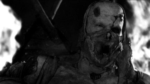
Unsurprisingly, the vast majority of covers for Mary Shelley’s book are directly inspired by the iconic movie versions of the story. Lightning bolts, electrical sparks, elaborate steampunk machinery, bubbling retorts, forbidding castles and foggy cemeteries are all elements from the films, as are the representations of the Monster as a stitched-up ogre, often green in complexion, with screws and studs as body piercing. Mary Shelley suggests the Monster is assembled from parts but she never actually mentions stitches, yet jagged sutures are a common element in cover designs for the book.
One of the most prevalent cover image is, simply, a photograph of the Monster as played by Boris Karloff. His interpretation from the second film, The Bride of Frankenstein, with a photogenic burned face and singed hair revealing a gruesomely stitched and clamped skull is the most popular with art directors. Artwork inspired by the classic Karloffian profile is, of course, ubiquitous. On the other hand, covers depicting the Monster as described by Mary Shelley are rare and generally reserved for art-book versions of the novel featuring top of the line illustrators such as Lynd Ward, Barry Moser and Bernie Wrightson.
Over time, I’ll spotlight original and interesting covers for Frankenstein and its derivatives. Sadly, the artists who drew or designed the covers are rarely credited by publishers.
The cover above is from the Barnes and Noble Classics Series edition of Frankenstein edited by George Stade and was designed, I believe, by Karen Karbiener.


